Data Visualization
Data Science: Data Visualization: A Comprehensive Guide
Data visualization is the process of representing data in a visual context, such as charts, graphs, maps, or plots, to make it easier to understand and interpret complex information. In today’s world, data visualization is crucial in transforming raw data into actionable insights, allowing both technical and non-technical users to make informed decisions.
❉ The Importance of Data Visualization
- Simplifying Complex Data
- Raw data often contains intricate patterns, relationships, and trends that can be difficult to comprehend. Data visualization simplifies these complex datasets into digestible, easy-to-understand formats. For example, a large dataset of sales transactions can be transformed into a line graph that quickly shows the sales trends over time.
- Improving Decision-Making
- Data visualization helps organizations make informed decisions. By visualizing key performance indicators (KPIs) and other critical metrics, businesses can identify opportunities, detect issues, and monitor progress more efficiently. Decision-makers often rely on dashboards and charts that summarize data for quicker insights.
- Identifying Trends and Patterns
- Visualizations allow you to detect trends, outliers, and patterns that may otherwise go unnoticed in raw data. For instance, a heatmap can reveal correlations in a data set that suggest areas for improvement or growth.
- Better Communication of Insights
- A picture is worth a thousand words. Data visualization enables analysts and data scientists to communicate their findings clearly and concisely to stakeholders, even those without technical backgrounds. This boosts collaboration and ensures that decisions are data-driven.
- Engagement and Retention
- Studies have shown that people are more likely to engage with visual content compared to text-based information. Visuals help retain attention, making it easier to convey important messages. This is especially important in marketing, sales presentations, or executive meetings where impactful visuals can significantly improve retention of the presented information.
❉ Types of Data Visualizations
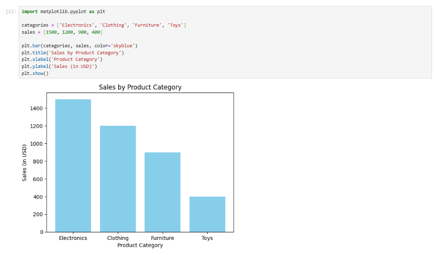
Bar Charts
- Purpose: Compare different categories.
- Description: A bar chart represents data with rectangular bars, where each bar’s length correlates to the value it represents.
- Best Used For: Comparing quantities across categories, such as sales per region or revenue by product.
- Example Use Case: Visualizing the total sales of different product categories.
import matplotlib.pyplot as plt
categories = ['Electronics', 'Clothing', 'Furniture', 'Toys']
sales = [1500, 1200, 900, 400]
plt.bar(categories, sales, color='skyblue')
plt.title('Sales by Product Category')
plt.xlabel('Product Category')
plt.ylabel('Sales (in USD)')
plt.show()
Line Graphs
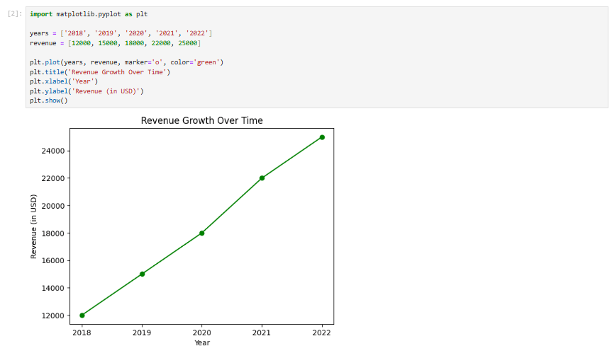
- Purpose: Show trends over time.
- Description: Line graphs connect individual data points with a continuous line to display how data evolves over a period.
- Best Used For: Tracking changes over time, such as stock prices or website traffic.
- Example Use Case: Showing a company’s revenue growth over the last five years.
import matplotlib.pyplot as plt
years = ['2018', '2019', '2020', '2021', '2022']
revenue = [12000, 15000, 18000, 22000, 25000]
plt.plot(years, revenue, marker='o', color='green')
plt.title('Revenue Growth Over Time')
plt.xlabel('Year')
plt.ylabel('Revenue (in USD)')
plt.show()
Pie Charts
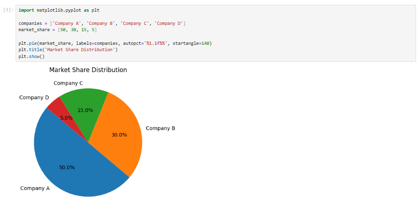
- Purpose: Show proportions or percentages of a whole.
- Description: Pie charts break down data into slices, each representing a category’s percentage of the total.
- Best Used For: Showing part-to-whole relationships, such as market share or budget allocation.
- Example Use Case: Showing the market share of different companies within an industry.
import matplotlib.pyplot as plt
companies = ['Company A', 'Company B', 'Company C', 'Company D']
market_share = [50, 30, 15, 5]
plt.pie(market_share, labels=companies, autopct='%1.1f%%', startangle=140)
plt.title('Market Share Distribution')
plt.show()
Heatmaps
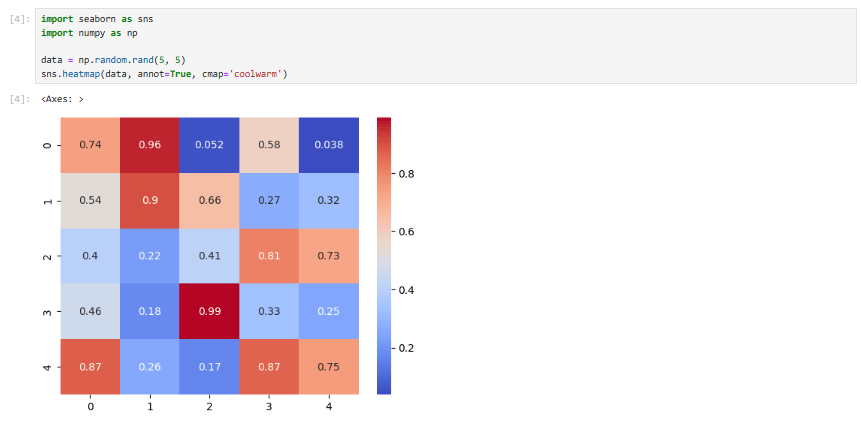
- Purpose: Represent data intensity using color gradients.
- Description: A heatmap uses color to represent data values in a matrix format, often used to visualize correlation matrices or other dense datasets.
- Best Used For: Correlation analysis or showing frequency distributions.
- Example Use Case: Showing correlations between variables in a dataset.
import seaborn as sns
import numpy as np
data = np.random.rand(5, 5)
sns.heatmap(data, annot=True, cmap='coolwarm')
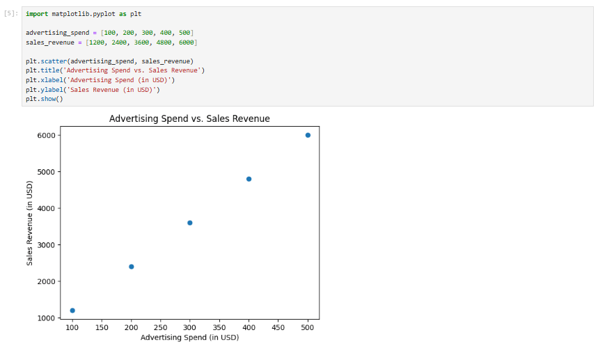
Scatter Plots
- Purpose: Show relationships between two variables.
- Description: A scatter plot uses dots to represent data points, with each dot’s position determined by two variables.
- Best Used For: Identifying correlations or outliers between variables.
- Example Use Case: Showing the relationship between advertising spend and sales revenue.
import matplotlib.pyplot as plt
advertising_spend = [100, 200, 300, 400, 500]
sales_revenue = [1200, 2400, 3600, 4800, 6000]
plt.scatter(advertising_spend, sales_revenue)
plt.title('Advertising Spend vs. Sales Revenue')
plt.xlabel('Advertising Spend (in USD)')
plt.ylabel('Sales Revenue (in USD)')
plt.show()
Histograms
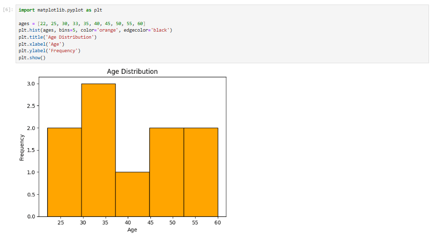
- Purpose: Show the distribution of a dataset.
- Description: A histogram groups data into bins and displays the frequency of data points in each bin.
- Best Used For: Visualizing distributions, such as test scores, age groups, or income levels.
- Example Use Case: Showing the age distribution of a population.
import matplotlib.pyplot as plt
ages = [22, 25, 30, 33, 35, 40, 45, 50, 55, 60]
plt.hist(ages, bins=5, color='orange', edgecolor='black')
plt.title('Age Distribution')
plt.xlabel('Age')
plt.ylabel('Frequency')
plt.show()
Box Plots (Box-and-Whisker Plots)
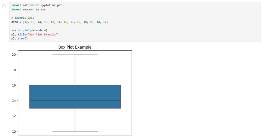
- Purpose: To display the distribution of data and highlight outliers.
- Description: Box plots are used to show the summary of a set of data values, highlighting the median, quartiles, and potential outliers.
- Best Used For: Visualizing the spread and skewness of the data, comparing distributions between several groups, and identifying outliers.
- Example Use Case: Analyzing the distribution of exam scores across different classes.
import matplotlib.pyplot as plt
import seaborn as sns
# Example Data
data = [12, 15, 14, 10, 12, 14, 16, 13, 15, 18, 20, 14, 17]
sns.boxplot(data=data)
plt.title('Box Plot Example')
plt.show()
Area Charts
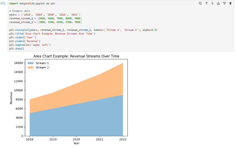
- Purpose: To show cumulative data over time.
- Description: Area charts are similar to line charts but with the area under the line filled. This makes them ideal for showing quantities that accumulate over time.
- Best Used For: Tracking the total change in a variable over time, particularly when it’s helpful to visualize how individual components contribute to the total.
- Example Use Case: Visualizing the growth of multiple revenue streams over time.
import matplotlib.pyplot as plt
# Example data
years = ['2018', '2019', '2020', '2021', '2022']
revenue_stream_1 = [5000, 6000, 7000, 8000, 9000]
revenue_stream_2 = [3000, 3500, 4500, 5500, 7000]
plt.stackplot(years, revenue_stream_1, revenue_stream_2, labels=['Stream 1', 'Stream 2'], alpha=0.5)
plt.title('Area Chart Example: Revenue Streams Over Time')
plt.xlabel('Year')
plt.ylabel('Revenue')
plt.legend(loc='upper left')
plt.show()
Radar Charts
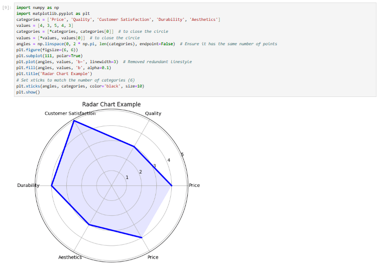
- Purpose: To display multivariate data in a radial format.
- Description: Radar charts are useful for comparing multiple quantitative variables in a circular layout. Each axis represents a different variable.
- Best Used For: Comparing several categories of data, especially when you want to visualize how each category performs in relation to others.
- Example Use Case: Comparing the performance of different products across multiple attributes (e.g., price, quality, customer satisfaction, etc.).
import numpy as np
import matplotlib.pyplot as plt
categories = ['Price', 'Quality', 'Customer Satisfaction', 'Durability', 'Aesthetics']
values = [4, 3, 5, 4, 3]
categories = [*categories, categories[0]] # to close the circle
values = [*values, values[0]] # to close the circle
angles = np.linspace(0, 2 * np.pi, len(categories), endpoint=False) # Ensure it has the same number of points
plt.figure(figsize=(6, 6))
plt.subplot(111, polar=True)
plt.plot(angles, values, 'b-', linewidth=3) # Removed redundant linestyle
plt.fill(angles, values, 'b', alpha=0.1)
plt.title('Radar Chart Example')
# Set xticks to match the number of categories (6)
plt.xticks(angles, categories, color='black', size=10)
plt.show()
Bubble Charts
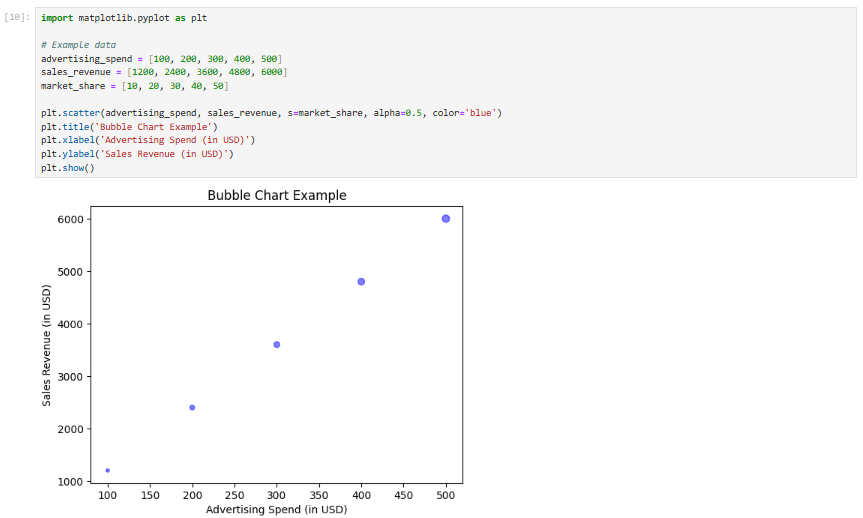
- Purpose: To display relationships between three variables.
- Description: A bubble chart is an extension of a scatter plot where the size of the bubble represents a third variable. This helps visualize the distribution and magnitude of a third dimension.
- Best Used For: Visualizing relationships between three continuous variables, such as comparing sales, profit, and market size.
- Example Use Case: Displaying the relationship between advertising spend, sales revenue, and market share.
import matplotlib.pyplot as plt
# Example data
advertising_spend = [100, 200, 300, 400, 500]
sales_revenue = [1200, 2400, 3600, 4800, 6000]
market_share = [10, 20, 30, 40, 50]
plt.scatter(advertising_spend, sales_revenue, s=market_share, alpha=0.5, color='blue')
plt.title('Bubble Chart Example')
plt.xlabel('Advertising Spend (in USD)')
plt.ylabel('Sales Revenue (in USD)')
plt.show()
Violin Plots
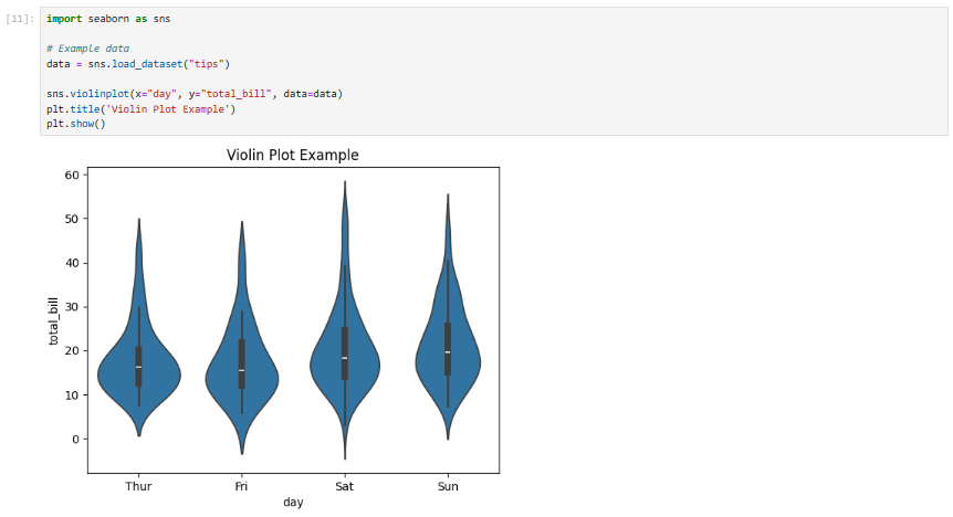
- Purpose: To show the distribution and frequency of data across different categories.
- Description: A violin plot combines aspects of both box plots and kernel density plots. It is particularly useful for showing the distribution of a continuous variable across different categories.
- Best Used For: Visualizing the distribution and density of data points across multiple categories.
- Example Use Case: Analyzing the distribution of customer age across different regions.
import seaborn as sns
# Example data
data = sns.load_dataset("tips")
sns.violinplot(x="day", y="total_bill", data=data)
plt.title('Violin Plot Example')
plt.show()
Waterfall Charts
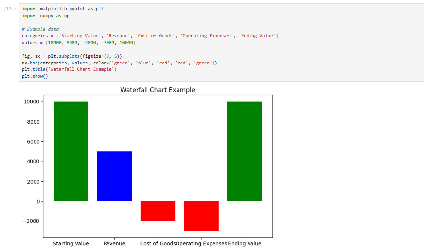
- Purpose: To show the cumulative impact of sequentially occurring positive or negative values.
- Description: A waterfall chart is a form of data visualization that helps in understanding how an initial value is affected by a series of positive or negative values. It is useful for financial reports or any sequential changes in data.
- Best Used For: Analyzing profit and loss statements, or tracking changes in a variable over a period.
- Example Use Case: Analyzing how individual costs affect the total profit.
import matplotlib.pyplot as plt
import numpy as np
# Example data
categories = ['Starting Value', 'Revenue', 'Cost of Goods', 'Operating Expenses', 'Ending Value']
values = [10000, 5000, -2000, -3000, 10000]
fig, ax = plt.subplots(figsize=(8, 5))
ax.bar(categories, values, color=['green', 'blue', 'red', 'red', 'green'])
plt.title('Waterfall Chart Example')
plt.show()
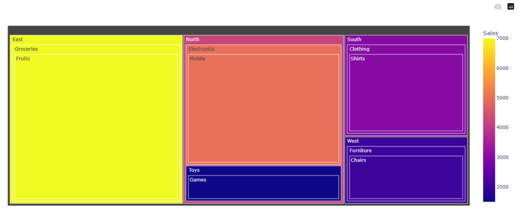
Treemaps
- Purpose: To represent hierarchical data using nested rectangles.
- Description: Treemaps display data in a compact and space-efficient way, where the size and color of each rectangle represent different dimensions of the data.
- Best Used For: Visualizing part-to-whole relationships in hierarchical data, such as sales performance across regions or product categories.
- Example Use Case: Displaying the distribution of sales revenue across multiple regions and categories.
import plotly.express as px
import pandas as pd
from plotly.offline import plot
# Example data: Sales by region and category
data = {'Category': ['Electronics', 'Clothing', 'Groceries', 'Furniture', 'Toys'],
'Subcategory': ['Mobile', 'Shirts', 'Fruits', 'Chairs', 'Games'],
'Sales': [5000, 3000, 7000, 2000, 1500],
'Region': ['North', 'South', 'East', 'West', 'North']}
df = pd.DataFrame(data)
fig = px.treemap(df, path=['Region', 'Category', 'Subcategory'], values='Sales', color='Sales', hover_data=['Sales'])
# Use plotly.offline to display the figure in Jupyter Notebook
plot(fig)

Sankey Diagrams
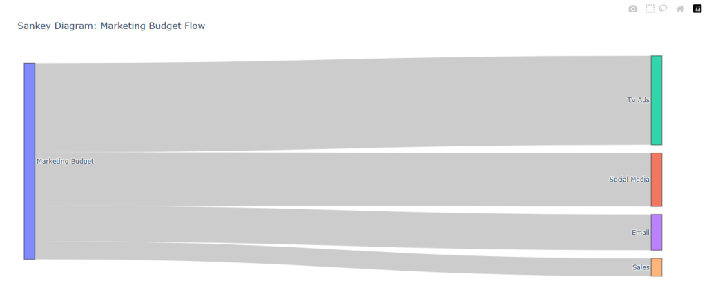
- Purpose: To visualize the flow of data from one set of values to another.
- Description: Sankey diagrams are useful for showing how quantities are distributed across various categories, particularly when there’s a flow or transition between categories.
- Best Used For: Displaying the flow of resources, financial data, or user journey analysis.
- Example Use Case: Visualizing how a marketing budget is distributed across different channels and its subsequent impact on sales.
import plotly.graph_objects as go
from plotly.offline import plot
# Example data: Budget flow
labels = ["Marketing Budget", "Social Media", "TV Ads", "Email", "Sales"]
sources = [0, 0, 0, 0] # From Marketing Budget
targets = [1, 2, 3, 4] # To respective channels
values = [3000, 5000, 2000, 1000] # Budget allocated
fig = go.Figure(go.Sankey(
node=dict(pad=15, thickness=20, line=dict(color="black", width=0.5), label=labels),
link=dict(source=sources, target=targets, value=values)
))
fig.update_layout(title="Sankey Diagram: Marketing Budget Flow")
# Use plotly.offline to display the figure in Jupyter Notebook
plot(fig)

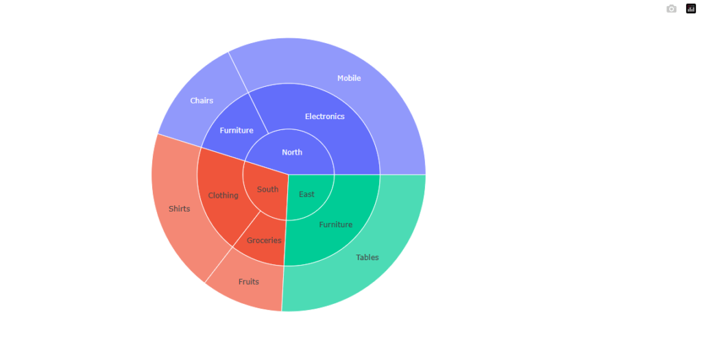
Sunburst Chart
- Purpose: To visualize hierarchical data with a radial layout.
- Description: Similar to treemaps, sunburst charts show hierarchical data in concentric circles. Each ring represents a level in the hierarchy.
- Best Used For: Visualizing hierarchical data, such as organizational structure, sales by product category, or website navigation paths.
- Example Use Case: Displaying sales data by region, product category, and subcategory.
import plotly.express as px
import pandas as pd
from plotly.offline import plot
# Example data: Sales hierarchy by region, category, and subcategory
data = {'Region': ['North', 'North', 'South', 'South', 'East'],
'Category': ['Electronics', 'Furniture', 'Clothing', 'Groceries', 'Furniture'],
'Subcategory': ['Mobile', 'Chairs', 'Shirts', 'Fruits', 'Tables'],
'Sales': [5000, 2000, 3000, 1500, 4000]}
df = pd.DataFrame(data)
fig = px.sunburst(df, path=['Region', 'Category', 'Subcategory'], values='Sales')
# Use plotly.offline to display the figure in Jupyter Notebook
plot(fig)

Parallel Coordinates Plot
- Purpose: To visualize multivariate numerical data.
- Description: Parallel coordinates plots are used to plot high-dimensional data in a 2D space, where each line represents a data point, and each axis represents a variable.
- Best Used For: Visualizing relationships between multiple variables in a dataset, and spotting trends or patterns across different dimensions.
- Example Use Case: Comparing the performance of different cars across various attributes (e.g., horsepower, weight, fuel efficiency).
import pandas as pd
import plotly.express as px
from plotly.offline import plot
# Example data: Car attributes dataset
data = {'Car': ['Car A', 'Car B', 'Car C', 'Car D', 'Car E'],
'Horsepower': [150, 180, 200, 170, 160],
'Weight': [3000, 2800, 3500, 3300, 3200],
'Fuel Efficiency': [25, 30, 20, 22, 28]}
df = pd.DataFrame(data)
fig = px.parallel_coordinates(df, color="Horsepower", labels={'Horsepower': 'Horsepower (HP)', 'Weight': 'Weight (lbs)', 'Fuel Efficiency': 'Fuel Efficiency (MPG)'})
# Use plotly.offline to display the figure in Jupyter Notebook
plot(fig)


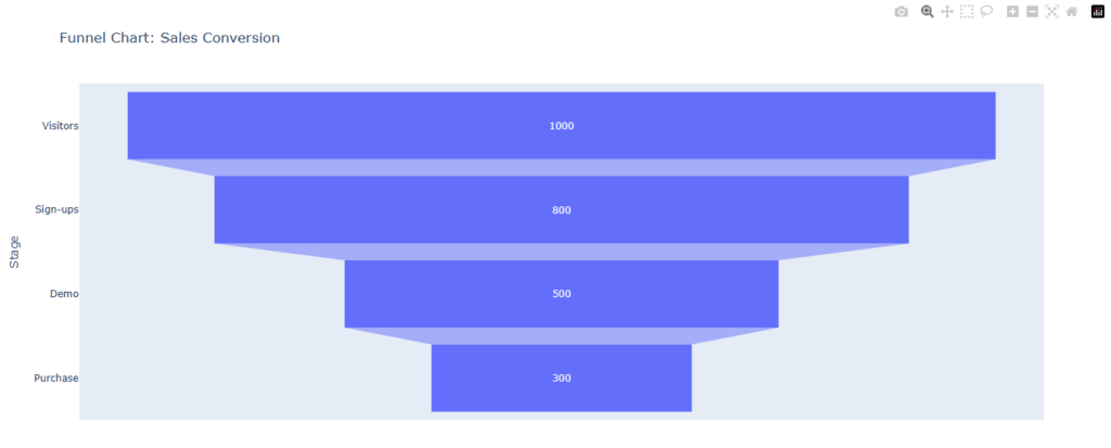
Funnel Chart
- Purpose: To visualize stages in a process and the drop-off between each stage.
- Description: Funnel charts are used to display the progressive reduction of data as it passes through different stages of a process. They are often used in sales and marketing.
- Best Used For: Analyzing stages in a sales pipeline, conversion rates, or customer journey tracking.
- Example Use Case: Showing the number of website visitors who make it through each stage of the conversion funnel.
import plotly.express as px
import pandas as pd
from plotly.offline import plot
# Example data: Sales conversion funnel
data = {'Stage': ['Visitors', 'Sign-ups', 'Demo', 'Purchase'],
'Count': [1000, 800, 500, 300]}
df = pd.DataFrame(data)
fig = px.funnel(df, x='Count', y='Stage', title="Funnel Chart: Sales Conversion")
# Use plotly.offline to display the figure in Jupyter Notebook
plot(fig)

❉ Best Practices for Data Visualization
- Know Your Audience:
- Before creating visualizations, understand who will be viewing the data. For example, an executive might need a high-level summary, while an analyst might need more detailed and granular insights.
- Choose the Right Chart Type:
- Each type of data visualization is best suited for different types of data. Choosing the right chart (bar chart, pie chart, heatmap, etc.) is critical for effective communication. For example, bar charts are great for categorical comparisons, while line charts are ideal for time series data.
- Ensure Readability:
- The key to effective data visualization is readability. Use clear labels, appropriate colors, and legible fonts. Avoid overwhelming your audience with too much information or too many design elements.
- Focus on the Message:
- The visualization should highlight the most important message. Avoid adding unnecessary details that might distract from the main point.
- Keep it Interactive:
- For large datasets, interactivity can help the viewer drill down into the data. Interactive visualizations allow users to hover over elements, zoom in on specific areas, and filter data to view details.
❉ Tools for Data Visualization
- Matplotlib
- Best For: Basic static visualizations.
- Strengths: Highly customizable, can generate almost any type of chart.
- Weaknesses: Requires more lines of code for complex visualizations, static by default.
- Seaborn
- Best For: Statistical visualizations.
- Strengths: Built on top of Matplotlib, easier to generate aesthetically pleasing plots with fewer lines of code.
- Weaknesses: Less flexible than Matplotlib for highly customized charts.
- Plotly
- Best For: Interactive visualizations.
- Strengths: Allows for interactive charts, such as zooming, panning, and real-time updates.
- Weaknesses: Learning curve and performance issues with very large datasets.
- Tableau
- Best For: Business intelligence.
- Strengths: Drag-and-drop interface, integration with numerous data sources, interactive dashboards.
- Weaknesses: Expensive licensing fees.
- Power BI
- Best For: Business analytics.
- Strengths: Seamless integration with Microsoft products, ease of use, great for business users.
- Weaknesses: Limited customization compared to Tableau.
- Google Data Studio
- Best For: Quick and easy report generation.
- Strengths: Free tool with good integration with Google products, simple interface.
- Weaknesses: Limited in advanced data visualization capabilities.
- D3.js
- Best For: Interactive and custom web visualizations.
- Strengths: Full flexibility for designing complex, interactive visualizations, highly customizable.
- Weaknesses: Requires coding knowledge, steep learning curve, more time-consuming for basic charts.
- Excel and Google Sheets
- Best For: Quick and simple visualizations.
- Strengths: Easy to use, widely accessible, supports a range of basic charts and simple analysis.
- Weaknesses: Limited customization, not suitable for complex or interactive visualizations.
❉ Key Principles for Effective Data Visualization
- Clarity: Strive for clarity in your visualizations. A clear chart enables users to understand the data without confusion.
- Accuracy: Ensure that your data is represented accurately, with proper scales, labels, and proportions.
- Simplicity: Avoid clutter. Keep your visuals clean by eliminating unnecessary elements, such as excessive gridlines or complex color schemes.
- Consistency: Use consistent colors, fonts, and visual styles across all visualizations to maintain a unified appearance.
- Context: Provide context where necessary. This could include labels, titles, or annotations that explain the significance of the data.
❉ Advanced Data Visualization Techniques
- Geospatial Visualization
- Geospatial visualizations represent data on maps, allowing users to understand spatial relationships in the data. Tools like Google Maps API, Mapbox, and Folium allow the integration of maps with data points to reveal geographical patterns.
- Time Series Analysis
- Time series visualizations are vital for understanding changes over time. Line graphs, area charts, and moving averages are often used to analyze trends, seasonal variations, and forecast future outcomes.
- 3D Plots
- For multidimensional data, 3D plots or scatter plots allow users to visualize data in three dimensions. Libraries like
PlotlyandMatplotliballow the creation of such plots for more complex analyses.
- For multidimensional data, 3D plots or scatter plots allow users to visualize data in three dimensions. Libraries like
❉ Conclusion
Data visualization is not just about making graphs; it’s about transforming raw data into visual stories that speak to the user. The right visualization can highlight patterns, trends, and insights that help in making informed decisions. As data grows increasingly complex, effective visualization becomes an even more powerful tool in understanding and interpreting data, making it essential for data analysts, business intelligence professionals, and data scientists. By using the correct visualization techniques and tools, businesses can not only present data but also uncover deeper insights that drive success.