Power BI Desktop Interface Overview
Comprehensive Guide to Navigating the Power BI Desktop Interface
Power BI Desktop is a powerful tool for data analysis and visualization. The interface is designed to make it easy for users to create interactive reports, dashboards, and visualizations from various data sources. This post will walk you through the key components of the Power BI Desktop interface in detail.
❉ Introduction to Power BI Desktop
When you open Power BI Desktop, you are greeted with a clean and intuitive interface, designed for both novice and advanced users. Power BI Desktop allows you to connect to various data sources, transform data, create reports, and publish them to Power BI Service.
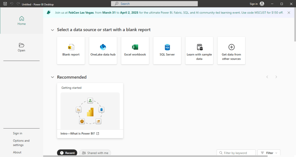
After opening Power BI Desktop, click on Blank Report to start a new report from scratch. This will load a clean workspace where you can begin importing data and building visualizations.
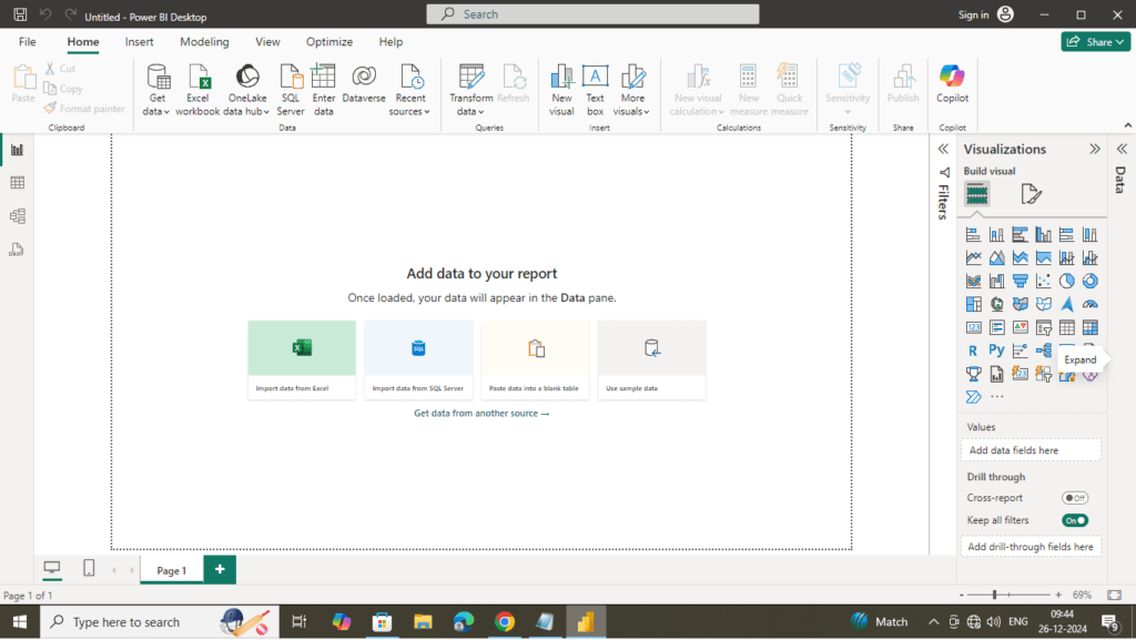
Now let’s break down each major part of the Power BI Desktop interface:
❉ Title Bar and Quick Access Toolbar
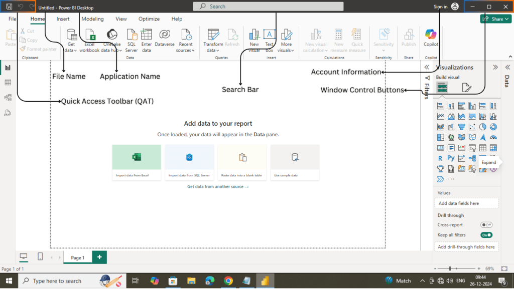
The Title Bar and Quick Access Toolbar are located at the very top of the Power BI Desktop interface. These components provide quick access to essential commands and display information about the current file and application.
Title Bar
The Title Bar is located at the very top of the Power BI Desktop interface and displays the name of the current report file, along with other important elements.
- File Name: Displays the name of the currently open Power BI report file (e.g.,
Report1). If you haven’t saved your file, it will display a default name likeUntitled. - Application Name: Shows “Power BI Desktop” to indicate the application in use.
- Unsaved Changes Indicator: When you make changes to a report but haven’t saved them, a small asterisk (
*) appears next to the file name to indicate unsaved changes. - Account Information: On the far right side, you will see your logged-in account details (if signed in). Clicking on your profile icon opens options for managing your Power BI account, such as switching accounts or signing out.
- Window Control Buttons: On the right-hand side of the Title Bar, you’ll find the standard window control buttons:
- Minimize: Minimizes the Power BI Desktop application to the taskbar.
- Maximize/Restore: Maximizes the window to full screen or restores it to its previous size.
- Close (X): Closes the Power BI Desktop application.
Quick Access Toolbar (QAT)
The Quick Access Toolbar is a small toolbar located to the left of the Title Bar. It provides shortcuts to commonly used actions, improving your workflow efficiency.
- Default Commands in the QAT:
- Save: Allows you to quickly save your current report file without having to navigate to the File menu.
- Undo: Reverses the last action you performed. This is especially useful when working on complex visualizations or data models.
- Redo: Restores an action that was undone using the Undo button.
Search Bar
To the right of the Title Bar is the Search Bar, which provides a quick way to locate features, commands, or help topics within Power BI Desktop. Simply type keywords, and Power BI will suggest relevant options, saving time and improving productivity.
- Use Cases for the Search Bar:
- Finding Features: If you’re unsure where a specific feature is located, the search bar can guide you.
- Help Topics: Access Microsoft documentation or tutorials for Power BI-related queries directly from the interface.
❉ Ribbon
The Ribbon in Power BI Desktop is a central part of the interface, located at the top, and it contains all the major tools you need to interact with and manipulate data, as well as build and design your reports. Each section of the Ribbon is organized into tabs, each of which focuses on a specific aspect of the report creation process. Below is a detailed explanation of each tab and the options they contain.

File Operations
Click on the “File” Tab: Located in the top left corner of the Power BI Desktop interface.
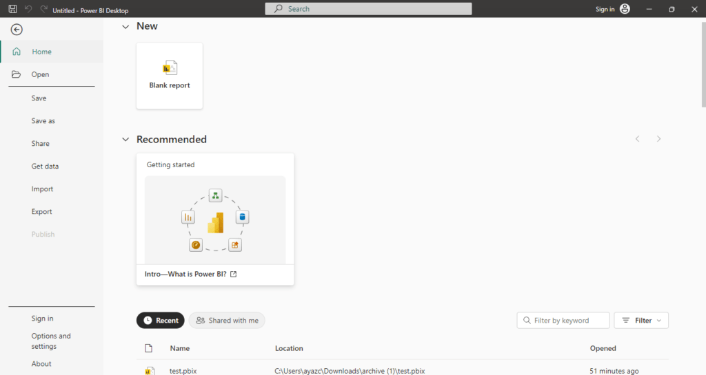
- File Options You Will See:
- New: Starts a new Power BI Desktop file.
- Open: Opens an existing Power BI file (.pbix) from your computer or a recent list.
- Save: Saves the current file.
- Save As: Saves the current file with a different name or location.
- Publish: Publishes the report to Power BI Service.
- Get Data: Allows you to import data from various sources (Excel, SQL Server, Web, etc.).
- Import: Imports data or custom visuals into your report.
- Export: Exports the data or report to other formats, such as Power BI template or PDF.
- Sign In: Sign in to your Power BI account to access cloud services and publish reports.
- Options and Settings: Contains options like “Options” to set your preferences.
- About: Provides information about the current version of Power BI Desktop.
- Recent: Displays a list of recently opened Power BI files (.pbix).
Home Tab
The Home Tab is the primary and most frequently used tab in Power BI Desktop. It provides essential tools for starting, saving, importing, transforming, and managing your report files.

- Get Data:
- This is a key option for importing data into Power BI from a variety of sources like:
- Excel, CSV, or XML files
- SQL Server, MySQL, PostgreSQL
- Web, APIs, and Cloud sources (Azure, Google Analytics)
- DirectQuery (live data connection to databases)
- Selecting this option opens the Get Data window, where you can choose the data source and specify connection details.

- This is a key option for importing data into Power BI from a variety of sources like:
- Transform Data:
- Clicking this button opens the Power Query Editor, where you can clean, shape, and transform the imported data before loading it into Power BI. This includes:
- Removing or filtering rows
- Merging or appending queries
- Changing data types
- Creating new columns or tables
- Power Query Editor:
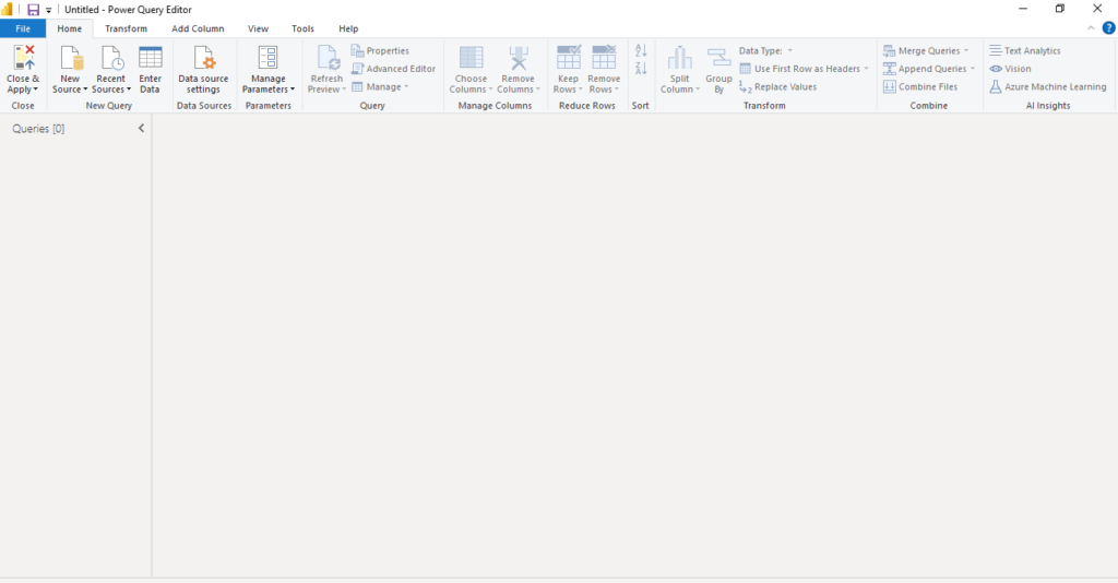
- Clicking this button opens the Power Query Editor, where you can clean, shape, and transform the imported data before loading it into Power BI. This includes:
- Publish:
- After completing the report, click this to publish your Power BI file to the Power BI Service. This allows you to share your report online, collaborate with others, and access it on any device.
- After completing the report, click this to publish your Power BI file to the Power BI Service. This allows you to share your report online, collaborate with others, and access it on any device.
- Refresh
- The Refresh button in the Home Tab ensures that your report reflects the latest data. If you are using live connections or have scheduled refreshes, clicking this button updates all visuals in the report.
- Manual Refresh
Updates the data in your report with the latest information from the connected data sources. - Automatic Refresh
Can be scheduled in the Power BI Service to update the report at regular intervals.
- Manual Refresh
- The Refresh button in the Home Tab ensures that your report reflects the latest data. If you are using live connections or have scheduled refreshes, clicking this button updates all visuals in the report.
- Enter Data :
Manually enter small datasets directly into Power BI without importing from an external source. - Clipboard Options
- Cut: Removes a selected visual or object and stores it in the clipboard.
- Copy: Duplicates a selected visual or object to the clipboard.
- Paste: Inserts the cut or copied item into the report canvas.
- Format Painter: Quickly copies the formatting of one visual and applies it to another.
- Insert Options
- New Visual: Adds a default visualization (e.g., chart) to the canvas.
- Text Box: Inserts a text box for annotations or custom text.
- More Visuals: Imports custom visuals from the Power BI marketplace.
- Calculations
Create Measures or Calculated Columns using DAX for advanced computations. - Recent Resources
Access recently used reports, datasets, or dataflows for quicker navigation.
The Home tab is where you begin your workflow and access the most common and frequently used tools.
Insert Tab
The Insert tab is used to add new elements into your report. This tab enhances the design and presentation of the report by allowing you to include various visual, AI-powered tools, and interactive elements.

- Pages
The Pages section allows you to manage and organize report pages within your Power BI file.- New Page
- Adds a completely blank page to your report.
- Useful for starting a fresh design without any pre-existing visuals or elements.
- Duplicate Page
- Creates an exact copy of the selected report page, including all visuals, filters, and formatting.
- Ideal for creating multiple variations of the same page with minor modifications.
- New Page
- Visuals
The Visuals section enables users to add new visualizations to the report canvas.- New Visual
- Adds a blank placeholder visual to the canvas that you can configure by dragging fields into it.
- This allows you to customize the type of visualization (e.g., bar chart, pie chart, line chart).
- More Visuals
- Opens the Power BI AppSource, where you can browse and import custom visuals created by Microsoft or the Power BI community.
- Custom visuals can include advanced charts, maps, and tools tailored to specific reporting needs.
- New Visual
- AI Visuals
The AI Visuals section incorporates artificial intelligence to provide advanced insights and interactivity in your reports.- Q&A Visual
- Allows users to type natural language questions about their data, and Power BI generates visuals dynamically based on the query.
- Example: Typing “Total sales by region” might create a bar chart showing sales by region.
- Key Influencers
- Analyzes data to identify key factors that influence a specific outcome (e.g., factors driving sales or customer satisfaction).
- Interactive and allows users to drill down into the data for deeper analysis.
- Decomposition Tree
- Breaks down data hierarchically to help users explore the contributions of various factors to a metric.
- Example: Analyzing sales by product category, region, and time period step-by-step.
- Smart Narrative
- Automatically generates text-based summaries of insights from your data.
- Helps to explain trends, patterns, and outliers without needing manual text entry.
- Q&A Visual
- Power Platform Integration
The Power Platform section provides integration with other Microsoft tools, enabling advanced workflows and automation.- Paginated Report
- Enables you to embed paginated reports (also known as “pixel-perfect” reports) created in Power BI Report Builder.
- Ideal for detailed, print-ready reporting.
- Power Apps
- Embeds a Power App directly into your report, allowing users to interact with data and perform actions without leaving the Power BI interface.
- Example: Updating a record in a database from within the report.
- Power Automate
- Integrates Power Automate flows into your report, enabling automation of repetitive tasks.
- Example: Setting up a flow to send email alerts when specific data thresholds are met.
- Paginated Report
- Elements
The Elements section provides tools for adding text, buttons, shapes, and images to your reports.- Text Box
- Adds a customizable text box to the canvas.
- Use it for titles, descriptions, annotations, or any other text-based content.
- Button
- Inserts an interactive button that can be configured for various actions (e.g., navigating to a page, applying a filter, or refreshing data).
- Button types include blank buttons, back buttons, and drill-through buttons.
- Shape
- Adds simple shapes like rectangles, circles, or lines to enhance the visual appeal of your reports.
- Shapes can be used for grouping visuals, creating borders, or directing attention to specific areas.
- Image
- Allows you to upload and insert images into your report.
- Useful for adding logos, icons, or other visual elements to align with your organization’s branding.
- Text Box
- Sparklines
The Sparklines section adds a lightweight, miniature chart to a table or matrix to represent trends over time or categories.- Add a Sparkline
- Creates a small line chart or bar chart that can be embedded directly into a table or matrix visual.
- Useful for displaying trends at a glance, such as monthly sales or stock price movements.
- Add a Sparkline
The Insert tab is essential for enriching the report with visual and interactive elements.
Model Tab
The Model tab is where you manage your data model, including relationships, calculated columns, and measures. This is where you define how data tables interact with one another and optimize the data for use in your visualizations.

- Relationships – Manage Relationships
The Relationships section in the Model Tab is where you can manage the connections between different tables in your data model. Relationships enable Power BI to understand how data from different tables is related and allows you to create complex visualizations that span across multiple datasets.- Manage Relationships
- View and Edit Relationships: Click on Manage Relationships to see all existing relationships between tables in your data model. You can:
- Edit: Modify the type of relationship (e.g., one-to-many, many-to-many).
- Delete: Remove a relationship.
- Create New: Add new relationships by linking tables based on common fields (keys).
- View and Edit Relationships: Click on Manage Relationships to see all existing relationships between tables in your data model. You can:
- Cardinality: Cardinality refers to the nature of the relationship between two tables, such as one-to-one, one-to-many, or many-to-many. Defining cardinality is important for accurate data modeling.
- Cross-filter Direction: You can define how filters propagate between tables. The options are:
- Single: Filters only propagate from one table to another.
- Both: Filters propagate in both directions, allowing more flexible interaction between tables.
- Manage Relationships
- Calculation – New Visual Calculation, New Measure, Quick Measure, New Column, New Table
The Calculation section within the Model Tab allows you to create and manage calculations that provide insights into your data and enhance visualizations. Power BI uses DAX (Data Analysis Expressions) to perform these calculations.- New Visual Calculation
- This option allows you to add a calculation directly on a specific visual in the report, making it easy to analyze and customize values dynamically.
- This option allows you to add a calculation directly on a specific visual in the report, making it easy to analyze and customize values dynamically.
- New Measure
- Measures are calculations that are applied across the entire dataset, and their results are based on the context of the visual or filter.
- A measure is typically used for aggregating data (e.g., sum, average, count) or for more complex calculations (e.g., growth rates, moving averages).
- To create a measure, you write DAX expressions in the formula bar. Measures are dynamic and respond to slicers, filters, and other interactions in the report.
- Measures are calculations that are applied across the entire dataset, and their results are based on the context of the visual or filter.
- New Visual Calculation
- Quick Measure
- Quick Measures allow you to create commonly used DAX calculations without having to write DAX manually. Power BI provides a range of pre-defined calculation templates for scenarios like:
- Running total.
- Year-over-year comparison.
- Percent change.
- Top N ranking.
- Weighted average.
- Select a Quick Measure from the menu, and Power BI generates the corresponding DAX formula for you.
- Quick Measures allow you to create commonly used DAX calculations without having to write DAX manually. Power BI provides a range of pre-defined calculation templates for scenarios like:
- New Column
- Columns are added to a table and calculated row by row. They are useful for deriving new values or creating calculated fields that will be part of the table’s data.
- Columns are static in that they are calculated once and don’t change unless the underlying data is refreshed.
- Example: If you wanted to create a Full Name column by combining first and last names, you would write a simple DAX formula to concatenate these fields.
- Columns are added to a table and calculated row by row. They are useful for deriving new values or creating calculated fields that will be part of the table’s data.
- New Table
- Tables can be created dynamically using DAX expressions. You can generate calculated tables that represent data subsets or new views of your data based on specific criteria.
- For example, you might create a summary table that aggregates sales data by region.
- For example, you might create a summary table that aggregates sales data by region.
- Tables can be created dynamically using DAX expressions. You can generate calculated tables that represent data subsets or new views of your data based on specific criteria.
- Page Refresh – Change Detection
The Page Refresh section helps you manage the data refresh behavior in your reports, ensuring that your reports and visuals reflect the latest available data.- Change Detection allows you to monitor changes in the data. This feature is used when working with DirectQuery or Live Connection data sources, as it helps Power BI identify and refresh visuals when the underlying data has changed.
- Auto-Refresh: Set Power BI to automatically refresh visuals when data changes, keeping your reports up-to-date without manual intervention.
- Thresholds: Configure how frequently Power BI checks for changes in the data to refresh the visuals.
- Change Detection allows you to monitor changes in the data. This feature is used when working with DirectQuery or Live Connection data sources, as it helps Power BI identify and refresh visuals when the underlying data has changed.
- Parameters – New Parameter (Numeric Range, Field)
Parameters provide flexibility in your data model and can be used to dynamically adjust the data shown in your reports. They can be tied to filters, slicers, or even calculation formulas.- New Parameter – Numeric Range
- Numeric Range Parameters allow you to define a range of numbers that users can select to filter or modify visualizations dynamically. For example, a parameter could allow users to set a sales threshold (e.g., $10,000 to $100,000) to filter sales data displayed in a report.
- Parameters are often used in scenarios where the user wants to control dynamic values like date ranges, filtering sales by thresholds, or changing scenarios (e.g., high/low forecasts).
- Parameters are often used in scenarios where the user wants to control dynamic values like date ranges, filtering sales by thresholds, or changing scenarios (e.g., high/low forecasts).
- Numeric Range Parameters allow you to define a range of numbers that users can select to filter or modify visualizations dynamically. For example, a parameter could allow users to set a sales threshold (e.g., $10,000 to $100,000) to filter sales data displayed in a report.
- New Parameter – Field
- Field Parameters are dynamic parameters based on existing fields in your data model. These parameters allow users to select from existing fields (such as categories, regions, etc.) to change how data is displayed across visuals.
- Field parameters enable users to interact with reports and see changes based on their selection of the field.
- Field parameters enable users to interact with reports and see changes based on their selection of the field.
- Field Parameters are dynamic parameters based on existing fields in your data model. These parameters allow users to select from existing fields (such as categories, regions, etc.) to change how data is displayed across visuals.
- New Parameter – Numeric Range
- Security – Manage Roles, View As
Security is a critical part of managing access to sensitive data. The Security section allows you to configure user roles and permissions for data access, ensuring that sensitive information is protected.- Manage Roles
- In Power BI, Roles are used to define security rules for different users, ensuring they only have access to the data that they are authorized to view.
- Row-Level Security (RLS): Create roles based on specific conditions (e.g., regional restrictions) to control which rows of data are visible to different users.
- Define DAX expressions to set conditions for who can see which data.
- You can test and configure multiple roles to ensure the correct visibility.
- In Power BI, Roles are used to define security rules for different users, ensuring they only have access to the data that they are authorized to view.
- View As
- The View As feature allows you to simulate the role of another user or role to test how the data and report will appear to them. This feature is helpful for validating that your security rules and role settings are applied correctly.
- You can select a specific role and see the report as if you were that user, ensuring no unauthorized data is visible.
- You can select a specific role and see the report as if you were that user, ensuring no unauthorized data is visible.
- The View As feature allows you to simulate the role of another user or role to test how the data and report will appear to them. This feature is helpful for validating that your security rules and role settings are applied correctly.
- Manage Roles
- Q&A – Q&A Setup, Language, Linguistic Schema
The Q&A feature in Power BI allows users to interact with reports using natural language queries. This makes it easier for non-technical users to analyze data by simply typing questions in plain language.- Q&A Setup
- The Q&A Setup allows you to configure the Q&A feature, which enables users to ask questions in natural language and receive data-driven responses in visual form.
- Set Up Synonyms: You can define synonyms for column names and table names to enhance user understanding and interaction with Q&A.
- Enable Q&A: Ensure that the Q&A feature is enabled so users can access it directly from the report.
- The Q&A Setup allows you to configure the Q&A feature, which enables users to ask questions in natural language and receive data-driven responses in visual form.
- Language
- Set the language preference for the Q&A feature. Power BI uses the language settings to interpret user queries and return results in the appropriate language.
- Language options include English, French, German, and many others.
- Language options include English, French, German, and many others.
- Set the language preference for the Q&A feature. Power BI uses the language settings to interpret user queries and return results in the appropriate language.
- Linguistic Schema
- The Linguistic Schema refers to the structure that Power BI uses to understand natural language queries. You can customize the schema by defining relationships between words or phrases and data fields to improve how Power BI interprets questions.
- Q&A Setup
The Model tab is focused on setting up and managing the underlying data model and ensuring your data relationships are structured properly for analysis.
View Tab
The View Tab in Power BI Desktop offers various settings and options that control the visual appearance and functionality of your report. This tab allows you to adjust how your report appears to users, control layout settings, and manage how visuals and other elements are presented on the canvas.

- Themes
The Themes option in the View Tab allows you to change the overall visual style of your Power BI report, including colors, fonts, and effects, to maintain consistency across reports.- Default Theme: Power BI provides a default theme with predefined colors and styles.
- Custom Theme: You can create or import custom themes to align the report with specific branding or visual preferences.
- Change Theme: By selecting a theme, Power BI automatically applies the chosen color palette, font style, and formatting to your visuals and report elements.
- Import Theme: You can import a custom theme file (JSON) to apply specific color schemes and visual properties.
- Page View: Actual Size, Fit to Page, Fit to Width
Page view settings help control how your report page fits within the report canvas window.- Actual Size: Displays the report canvas at 100% of its actual size.
Use this view to see the report at its real resolution, useful for checking pixel-level alignment and layout. - Fit to Page: Scales the entire report page to fit within the Power BI window.
This view is useful when you want to ensure that the entire report is visible without scrolling, regardless of the report’s actual size. - Fit to Width: Scales the report page horizontally to fit the width of the Power BI window.
This is particularly useful for ensuring that the report content is fully visible across the width of the screen without requiring horizontal scrolling, but it may cause the height to be cropped.
- Actual Size: Displays the report canvas at 100% of its actual size.
- Mobile Layout
- The Mobile Layout option allows you to customize the appearance of your report when viewed on mobile devices. In Power BI, the design of reports on desktop can differ significantly from mobile devices, especially when working with a limited screen size.
- When you click on Mobile Layout, Power BI automatically opens a mobile layout view where you can rearrange the visuals, resize them, and optimize the experience for mobile users.
- The Mobile Layout option allows you to customize the appearance of your report when viewed on mobile devices. In Power BI, the design of reports on desktop can differ significantly from mobile devices, especially when working with a limited screen size.
- Page Options: Gridlines, Snap to Grid, Lock Objects
The Page Options in the View Tab help you control the layout and alignment of objects and visuals on the report canvas.- Gridlines: Gridlines are visible lines that help you align and position your visuals on the report canvas.
Turn on Gridlines to display horizontal and vertical lines across the canvas. This is helpful for visual alignment, ensuring that objects are arranged neatly. - Snap to Grid: When enabled, objects (such as visuals, text boxes, and shapes) will automatically “snap” into place when they are close to a gridline.
Use Snap to Grid to ensure consistent spacing and alignment of objects on the report canvas, making the layout cleaner and more organized. - Lock Objects: This option allows you to lock objects on the canvas so that they cannot be moved, resized, or deleted accidentally.
Locking objects is useful when you’ve finalized the positioning of elements in your report and want to avoid accidental changes while working on other parts of the report.
- Gridlines: Gridlines are visible lines that help you align and position your visuals on the report canvas.
- Show Panes: Filter, Bookmarks, Selection, Performance Analyzer, Sync Slicers
The Show Panes section provides options for displaying additional panes that help with report interactivity and analysis. These panes are useful for managing filters, bookmarks, and slicers, as well as analyzing performance.- Filters Pane: The Filters Pane allows you to view and manage all filters applied to your report or individual visuals.
Turn on the Filters Pane to allow users or yourself to quickly see which filters are active and make adjustments. You can apply, remove, and customize filters for individual report elements.
- Filters Pane: The Filters Pane allows you to view and manage all filters applied to your report or individual visuals.
- Bookmarks Pane: Bookmarks are used to capture the current state of a report page, including filters, slicers, and visuals. This allows users to easily navigate between different report views and return to saved report states.
The Bookmarks Pane displays all saved bookmarks and allows users to click and navigate to those predefined views. Bookmarks are useful for storytelling and creating guided report experiences. - Selection Pane: The Selection Pane allows you to manage the visibility and layering of visuals on the report canvas.
The Selection Pane is particularly useful when working with overlapping objects. It allows you to show or hide objects, change their layering (send backward/bring forward), and organize complex report pages. - Performance Analyzer: The Performance Analyzer helps you monitor the performance of your report, especially how long each visual takes to render and load data.
Turn on the Performance Analyzer to identify performance bottlenecks, track query execution time, and optimize the report for better performance. You can also export the performance data for further analysis. - Sync Slicers: Sync Slicers is a feature that allows you to synchronize slicers across multiple report pages. This ensures that when a user selects a value in one slicer, the corresponding slicers on other pages update automatically.
When you have multiple pages in your report and want to apply the same filter or slicer selection across pages, the Sync Slicers pane allows you to manage and configure which slicers are synchronized.
The View tab is primarily for customizing the report’s appearance, working with different views, and ensuring your report’s layout is consistent and well-structured.
Optimize Tab
The Optimize tab in Power BI Desktop helps improve report performance and control how visuals interact with your data.

- Queries: Pause & Refresh Visual
- Pause Visual: Temporarily halts the visual from refreshing, helping to improve performance during data exploration.
- Refresh Visual: Forces a visual to reload its data when necessary (useful after applying filters or slicers).
- Optimization Presets
- Query Reduction: Reduces the number of queries sent to the data source by limiting cross-filtering and interactions between visuals.
- Interactive: Ensures visuals only refresh when necessary (user interaction), improving performance.
- Customize: Allows fine-tuned settings for query behavior, enabling more granular performance control.
- Performance Analyzer: Tracks the performance of each visual in the report, providing insights into how long each visual takes to render and interact. Helps identify bottlenecks and optimize report performance.
- Apply All Slicer Button: Allows you to apply slicer settings across all visuals in a report, enabling consistent filtering and improving user experience.
Help Tab
The Help tab in Power BI Desktop provides access to useful resources, support options, and learning materials.

- Info (About)
- About: Provides information about the version and release details of Power BI Desktop, including build numbers and updates.
- About: Provides information about the version and release details of Power BI Desktop, including build numbers and updates.
- Help
- Guided Learning: Access to tutorials and courses designed for learning Power BI.
- Training Videos: A collection of instructional videos to help you get started or enhance your skills.
- Documentation: Links to official Power BI documentation for in-depth guidance on using the software.
- Support: Access to Microsoft support for troubleshooting issues or contacting help.
- Community
- Power BI Blog: Read the latest news, updates, and tips from the Power BI team.
- Community: Join the Power BI Community for discussions, tips, and troubleshooting with other users.
- Power BI for Developers: Resources and tools for developers working with Power BI APIs and embedded solutions.
- Submit an Idea: Suggest new features or improvements for Power BI through the Power BI Ideas platform.
- External Tools: Links to third-party tools and add-ons compatible with Power BI.
- Resources
- Examples
- Sample Data: Access example datasets to practice or showcase Power BI capabilities.
- Sample Reports: Pre-built reports to understand Power BI features or use as templates.
- Community Galleries: Explore community-contributed reports, dashboards, and visualizations.
- Partner Showcase: View Power BI solutions and success stories from partners.
- Consulting Services: Find consulting services and professional support for Power BI projects.
- Examples
Other Tabs
- Table Tools Tab

- Purpose: Manage table-level properties.
- When it Appears: Visible when a table is selected in the Fields pane.
- Key Features:
- Rename tables.
- Mark as Date Table.
- Manage relationships.
- Column Tools Tab

- Purpose: Manage column-level settings.
- When it Appears: Visible when a column is selected in the Fields pane.
- Key Features:
- Data type and format (e.g., currency, date).
- Summarization options (Sum, Average, Count).
- Sort by another column.
- Format Tab

- Purpose: Used for aligning visuals, editing interactions, and managing visual placement.
- When it Appears: Visible when a visual is selected on the report canvas.
- Key Features:
- Control how visuals interact with each other (e.g., filter, highlight, or none).
- Align visuals to the left, right, top, or bottom for consistent layout.
- Move visuals forward or backward to control layering.
- Data/Drill Tab

- Purpose: Configure data interaction and drill-through functionality.
- When it Appears: Visible when working with hierarchical visuals (e.g., bar charts, tables).
- Key Features:
- Drill up/down through hierarchies.
- Drill through
- Expand all levels.
These contextual tabs dynamically appear based on your selection, enhancing productivity by providing relevant tools as needed.
❉ Report Canvas
The report canvas is the central area of Power BI Desktop where you create visualizations and build your report. It serves as a workspace for dragging and dropping fields, creating charts, and laying out your report.
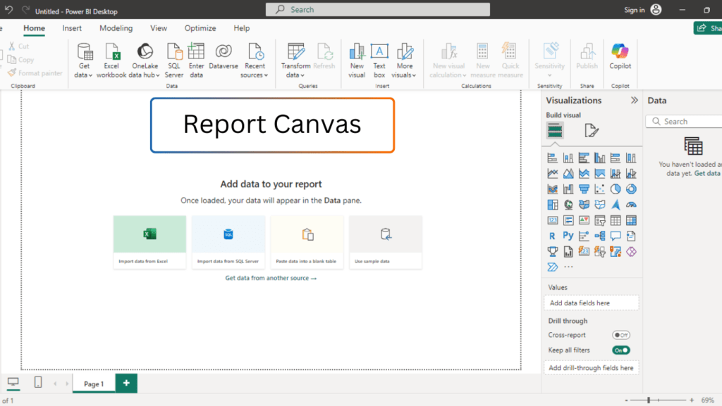
- Interactive Area: The report canvas is highly interactive, meaning you can click on any visualization to filter data or drill into more granular details.
- Customizable Layout: You can adjust the size and layout of the canvas to fit your needs. The canvas is flexible and resizable.
- Multiple Pages: You can have multiple report pages within the canvas, making it easy to create different views of your data.
When you drag fields from the Fields pane, the visualizations automatically populate the canvas based on the type of data. For example, dragging a “Sales” field onto the canvas could create a bar chart showing sales over time.
❉ Fields Pane
The Fields pane is located on the right side of the Power BI Desktop interface and lists all the tables and fields from your data model. It’s your primary tool for selecting the data you want to use in your visualizations.
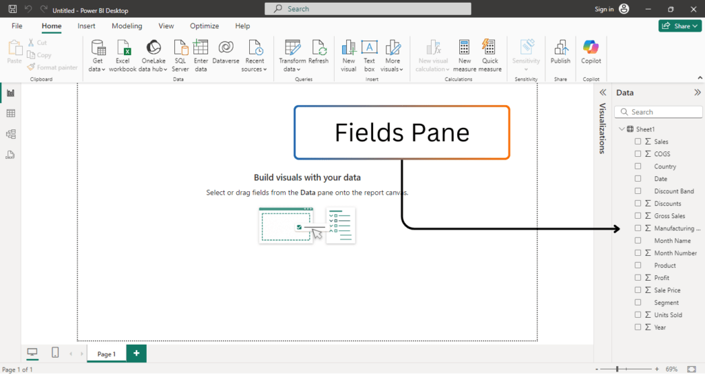
- Tables and Columns: The Fields pane displays the tables you’ve loaded into Power BI. Clicking on a table will expand it to show the columns and measures inside that table.
- Fields Drag-and-Drop: You can drag fields from this pane onto the canvas to create visualizations. For example, dragging a numeric field like “Sales Amount” could create a measure in a chart.
- Search and Filter: You can search for specific fields or tables using the search bar at the top of the pane.
The Fields pane allows you to organize your data and quickly find what you need to use in your reports.
❉ Visualizations Pane
The Visualizations pane is another crucial component of Power BI Desktop, located next to the Fields pane. This pane allows you to choose from a wide variety of visualizations, such as bar charts, pie charts, tables, maps, and many more.
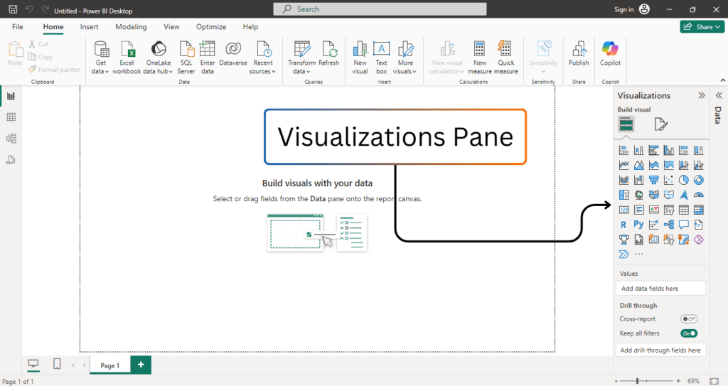
- Visualization Types: Power BI provides a variety of pre-built visualization types, including:
- Bar Charts
- Line Charts
- Pie Charts
- Scatter Plots
- Tables
- Maps
- KPIs
- Slicers
- And many more…
- Visualization Formatting: Once a visualization is added to the canvas, you can format it using the options available in the Visualizations pane. You can customize colors, axis labels, fonts, and many other elements.
- Custom Visuals: In addition to the standard visuals, Power BI supports custom visuals, which are additional visualizations created by third-party developers. You can import these visuals from the Power BI marketplace.
This pane is used to choose how you want to represent the data in your reports, and it provides flexibility in creating different types of visuals.
❉ Filters Pane
The Filters pane is located on the right side of the interface, just below the Fields and Visualizations panes. This component is used to apply filters to your entire report, specific pages, or individual visualizations.
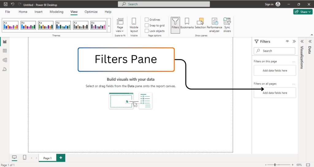
- Report-Level Filters: These filters apply to the entire report and affect all the visualizations across all pages.
- Page-Level Filters: These filters apply only to the current page in your report, allowing for more granular control of your data visualizations.
- Visualization-Level Filters: You can also apply filters to individual visualizations, providing flexibility in controlling how data is represented.
You can drag fields from the Fields pane into the Filters pane and then specify the filter condition. For example, you could filter a bar chart to display sales data for a specific region or time period.
The Filters pane helps you customize and control the data that is visible in your reports, giving users the ability to focus on specific segments or categories.
❉ Page Navigation
At the bottom of the Power BI Desktop interface, you will see the page navigation bar, which contains thumbnails of all the pages in your report. Power BI allows you to have multiple pages within a report, and the page navigation bar makes it easy to switch between them.
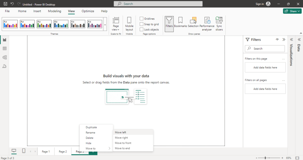
- Add New Pages: You can add new pages by clicking the “+” button. Each page can have its own set of visualizations.
- Rename Pages: Right-click on a page to rename it, making it easier to organize your report if you have multiple pages.
- Duplicate Pages: You can also duplicate pages to create a similar layout with different filters or data views.
- Delete Pages: If you no longer need a page, you can delete it by right-clicking on the page tab and selecting “Delete.”
This navigation feature allows you to structure your reports into multiple sections, making it easier to manage complex reports with lots of data and visualizations.
❉ Power BI Desktop: The Left-Side Views
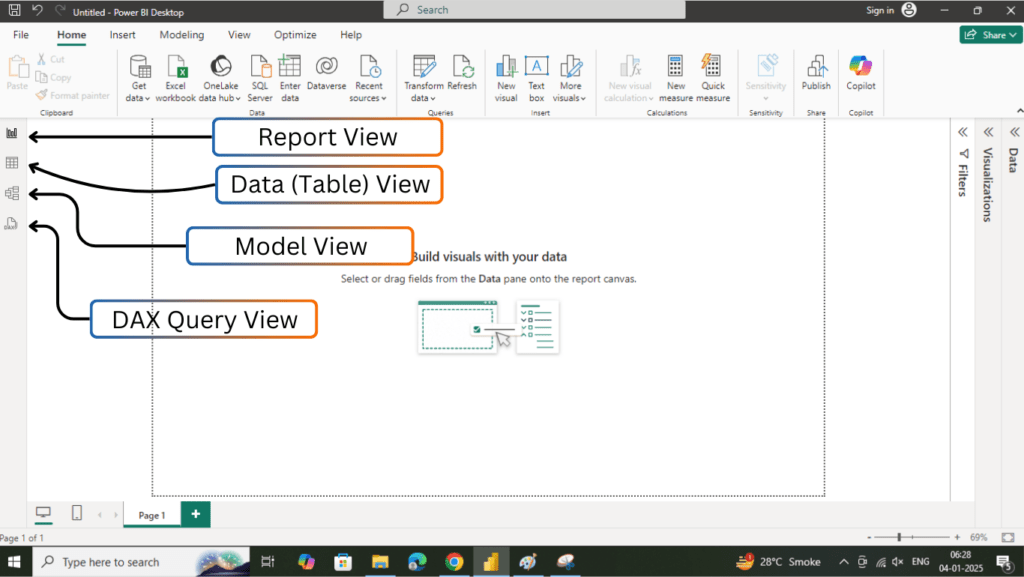
On the left side of the Power BI Desktop interface, you will find four main views that are essential for different aspects of report creation and data modeling. These views are:
- Report View
- Data (Table) View
- Model View
- DAX Query View
Report View
The Report View is the default view when you open Power BI Desktop. It is where you design and build interactive reports and dashboards.
- Visualization Canvas: This is where all visualizations, such as charts, graphs, maps, and tables, are added and arranged. It provides a grid-like interface for easy alignment of visuals.
- Page Tabs: Located at the bottom of the screen, these allow you to create and manage multiple pages in your report. Each page can have a unique set of visuals.
- Resizing Visuals: You can resize the visualizations on the canvas to make them fit the page layout.
- Aligning Visuals: Power BI provides gridlines and snap-to-grid features that help you align visuals neatly on the canvas. This is essential for creating professional-looking reports.
- Custom Visuals: You can add custom visuals from the Power BI Marketplace for enhanced data storytelling.
- Interactivity: All visuals in this view are interactive, allowing you to cross-filter and highlight data dynamically by interacting with charts and tables.
The Report View is where most of your creative work takes place, making it the core of Power BI Desktop.
Data (Table) View
The Data View, often referred to as the Table View, is focused on viewing and working with the raw data behind your reports.
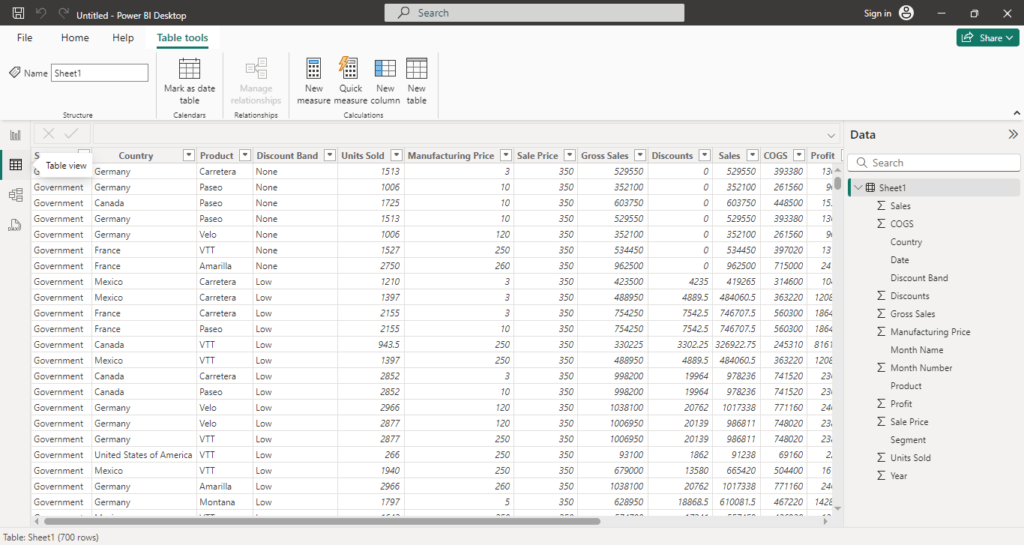
- View Data: Displays data from your connected data sources in tabular format. You can inspect each row and column of your datasets to ensure accuracy and consistency.
- Create Calculated Columns: Directly create new calculated columns using DAX (Data Analysis Expressions) formulas. These columns are immediately available for use in visuals.
- Sort and Filter Data: You can sort data columns or apply filters for a detailed look at specific subsets of your data.
- Modify Data: Rename columns, change data types, or update column formatting directly within this view.
This view is ideal for data exploration and fine-tuning before visualizing it in reports.
Model View
The Model View is where you define the structure and relationships of your data model. It is crucial for organizing your data efficiently and ensuring accurate reporting.
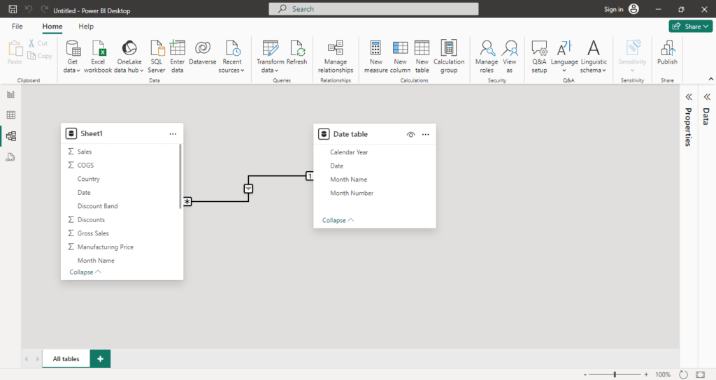
- Tables Overview: Displays all the tables loaded into Power BI, giving you a bird’s-eye view of your data model.
- Relationships Management:
- You can establish relationships between tables by dragging and connecting fields.
- Modify relationships by setting cardinality (one-to-one, one-to-many, etc.) and filter directions.
- Create Measures: Write DAX formulas to create calculated measures, such as totals, averages, or percentages, which are then used in your visuals.
- Define Hierarchies: Create hierarchies (e.g., Year > Quarter > Month) to enable drill-down functionality in your visualizations.
The Model View ensures that your data is well-organized and relationships are correctly configured, leading to more accurate and insightful reports.
DAX Query View
The DAX Query View is specifically for advanced users who want to write custom DAX queries. This view is not as commonly used as the other three but is powerful for specific scenarios.
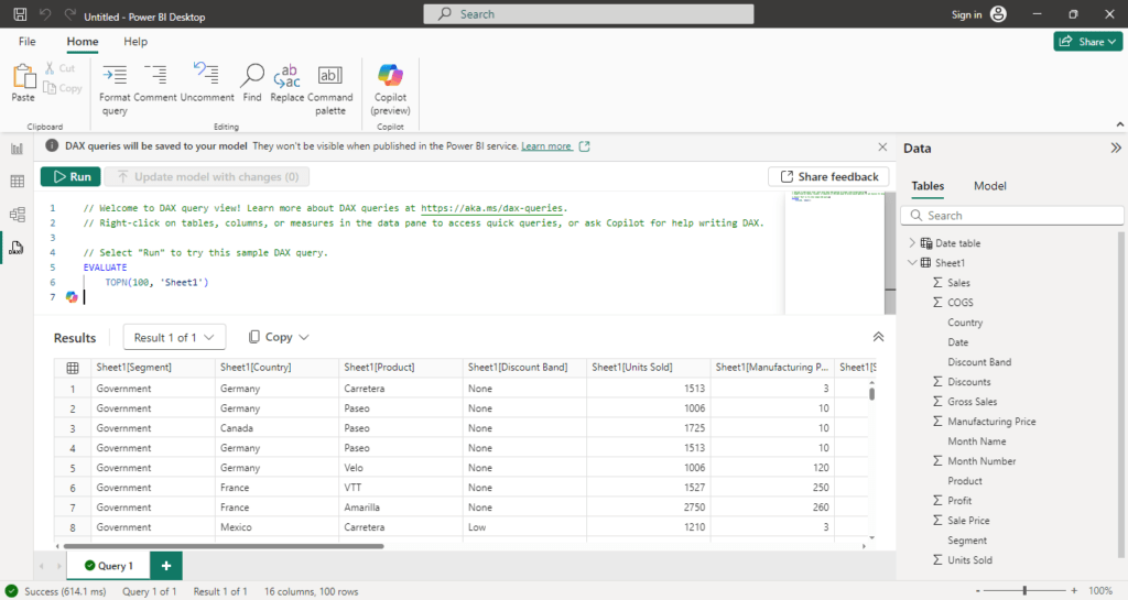
- Query Editor: Write custom DAX queries to create calculated tables or perform advanced aggregations.
- Advanced Calculations: Use this view to generate measures or tables that cannot be directly created using the standard interface.
- Data Analysis: Execute queries to analyze and extract insights from your data model, helping you refine your report.
The DAX Query View is particularly useful for users who are proficient in DAX and need more control over their data model.
❉ Conclusion
In this detailed guide, we explored the Power BI Desktop interface, breaking down its key components and functionality. Understanding the layout and each of the interface elements is crucial for creating effective and efficient reports in Power BI. From the Ribbon to the Filters Pane, Report Canvas, and Data Views, each element plays a unique role in the overall workflow of creating interactive dashboards and visualizations.
By becoming familiar with these interface components, you’ll be able to navigate Power BI Desktop with ease, enabling you to transform your data into meaningful insights and share them with stakeholders.
Power BI Desktop provides an intuitive yet powerful environment for data analysts and business intelligence professionals to work with data and create impactful reports. With practice, you’ll be able to fully leverage the tool’s capabilities and produce high-quality reports that drive data-driven decision-making.